My Portfolio Website

Overview
The Challenge
For Career Foundry’s Frontend Development for UX Designers specialization course, I was challenged to create my own portfolio website from scratch to display all the UX/UI projects I have completed and to show who I am as a unique designer.
The Background
A portfolio website is key in showcasing my work to future employers to obtain a UX design position. Learning to build a website also gave me a chance to understand the role of web developers, and how UX designers can utilize web development knowledge to better collaborate on projects.
My Role
I was responsible for coding the entire website including: HTML, CSS and JavaScript, as well as creating the layout, style, and color scheme to represent myself as a designer. This challenge lasted from May 2020 - August 2020. The portfolio website is now completed and is hosted on Git Hub pages.
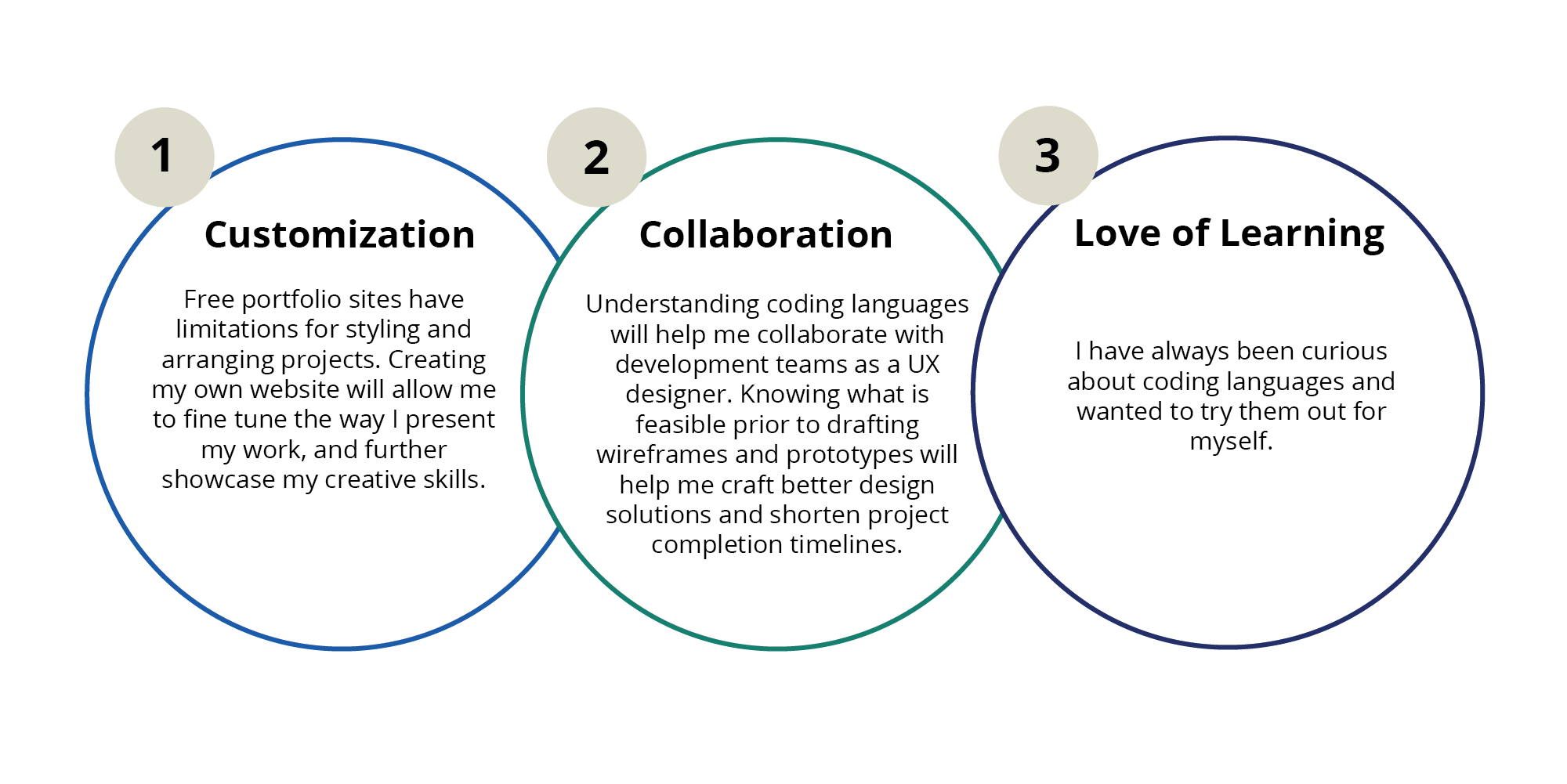
Why Design a Website from Scratch?
With the multitude of free portfolio websites available to designers, why would I want to make my own from the ground up? There are a few key reasons.
Understanding the Problem
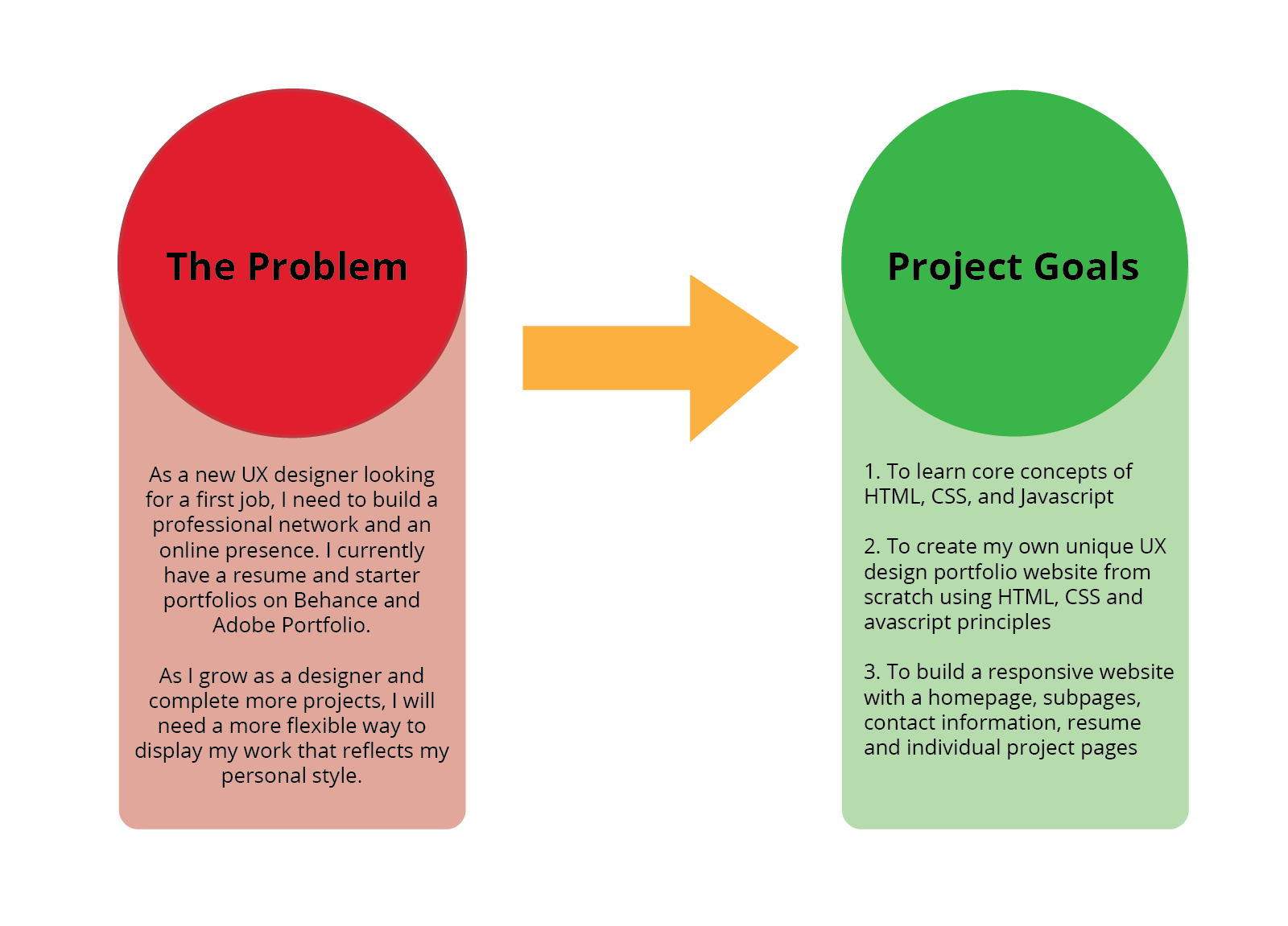
I began by outlining the problem I was trying to solve and the goals for my portfolio website project.
My Process
#1 Defining User Goals
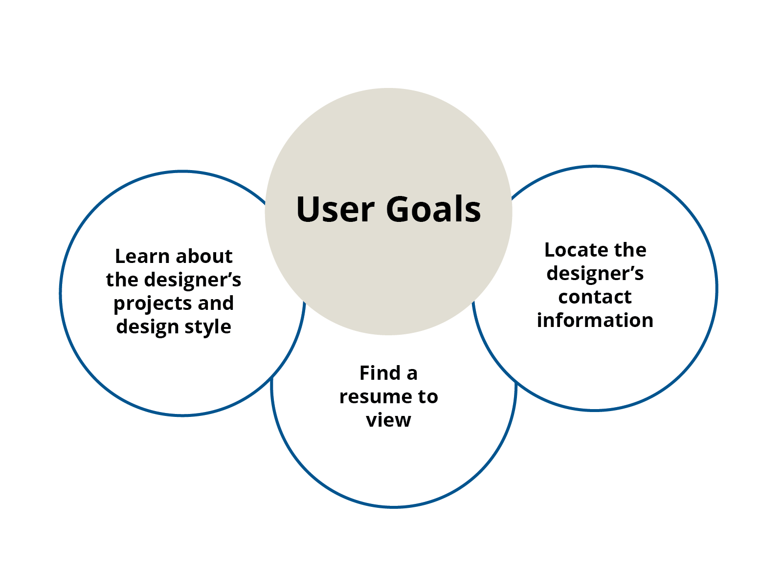
I began by researching who the target user group for my portfolio website would be and defining user goals.
I identified that my target user group will consist of: potential employers or colleagues interested in my design work, or looking to contact me about a job, collaboration, or general interest. They will all likely be viewing the site from a wide array of devices and viewports.
#2 Preparing My Information
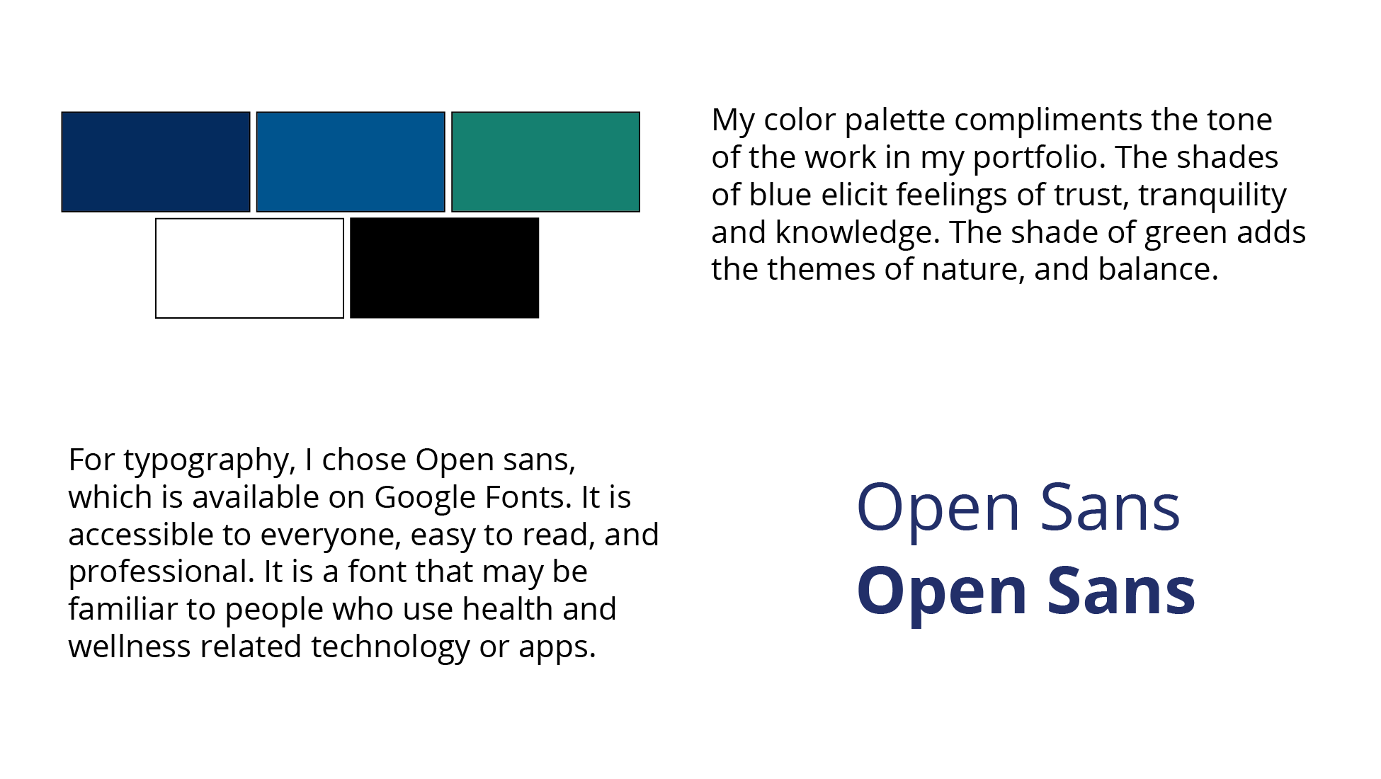
Next, I reviewed my past projects and gathered the key information and images that I wanted to present on this portfolio website. I wrote an introduction for myself and a synopsis of how I came into UX.
#3 Architecture and Wireframes
Information Architecture
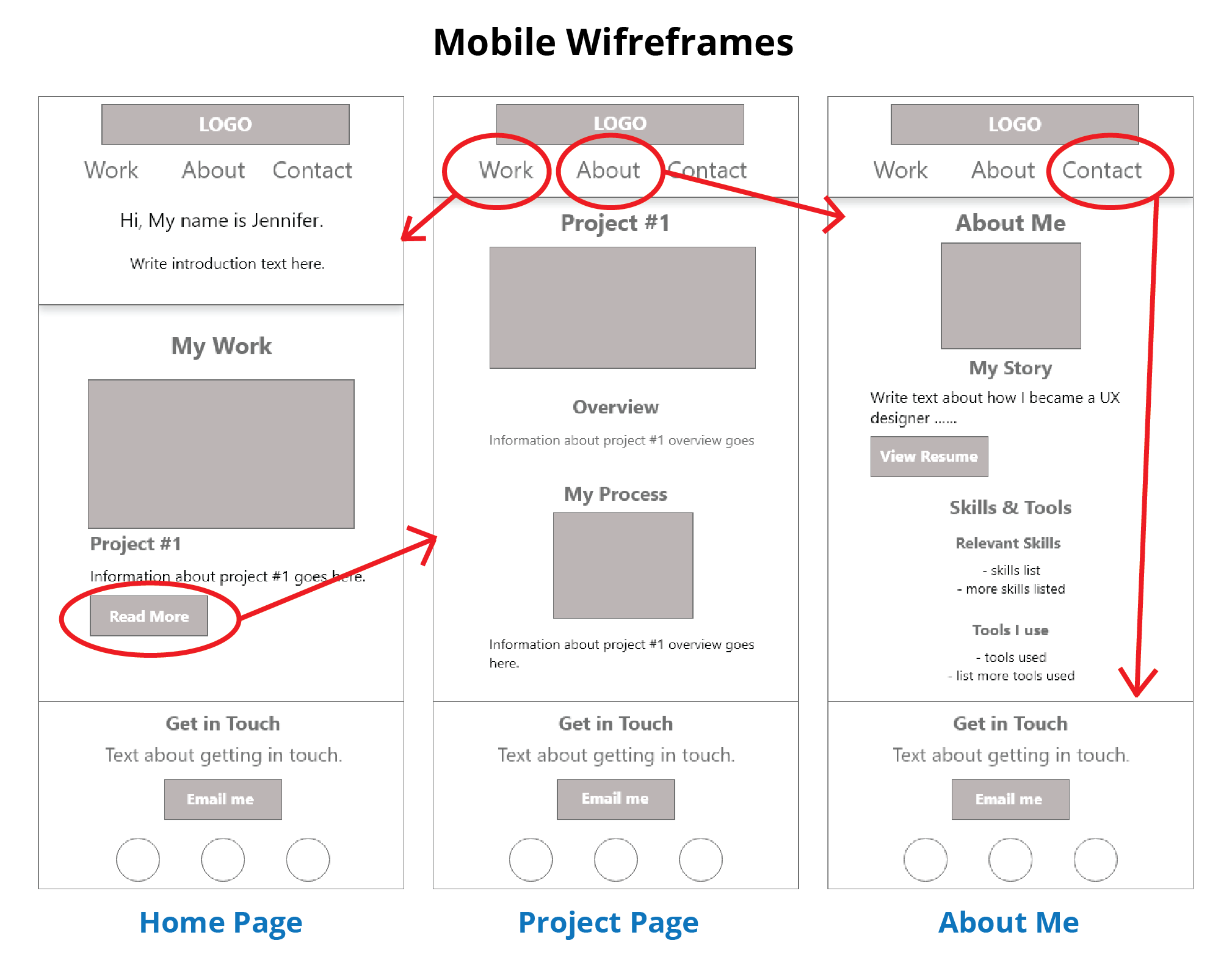
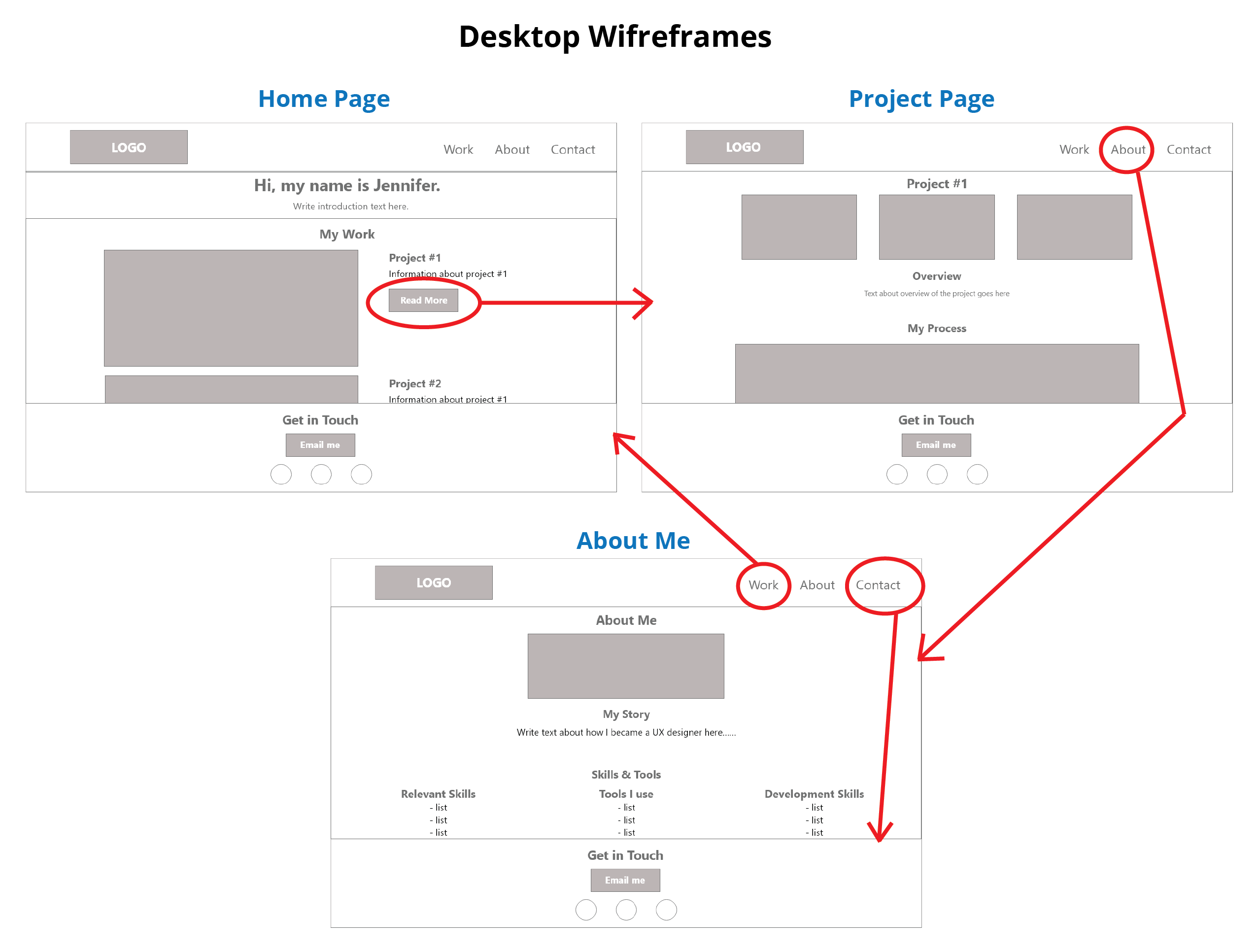
I decided to keep my information organized in the simplest way possible to make the website user friendly. The faster an employer can find what they need, the more likely they are to follow up and want to offer a job. The navigation options include: Work (the homepage where all projects will be listed), About, and Contact.
Wireframes
Next, I briefly sketched some layout ideas on paper for each of my website pages. Then, once satisfied, I built them in grayscale in Adobe XD. I kept the wireframes simple to avoid overwhelming the person viewing the website with too much information or visuals.
#4 User Testing
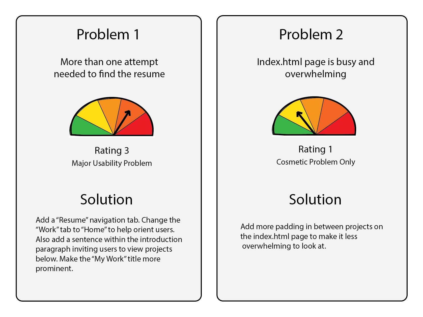
I then created a usability testing plan and script to test my website on 5 individuals. I analyzed results using success criteria for each task and the Jakob Nielson’s usability problem scale. Overall, the results and feedback were positive. There were two main problem areas that needed correcting.
#5 Code Quality and Browser Testing
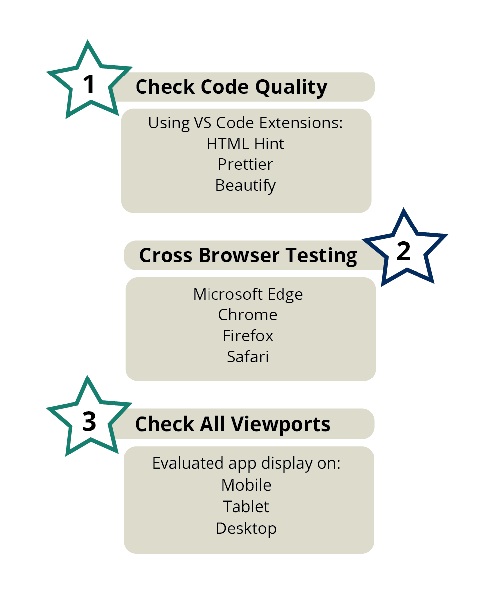
I used VS Code extensions to fix errors within my code and adjust alignment, including: Html hint, Beautify, and Prettier.
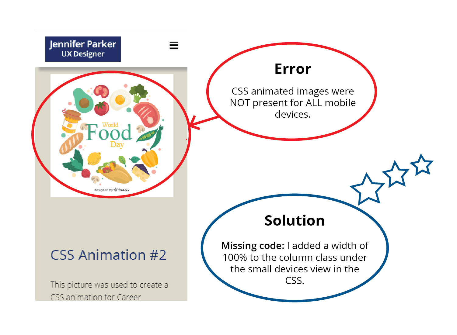
I then completed a cross browser test on multiple internet browsers including: Microsoft Edge, Chrome, Firefox, and Safari. I also checked how my responsive website looked in all viewports: mobile, tablet, desktop. For the most part, everything looked as intended. There was only one significant error that needed to be corrected.
Solution
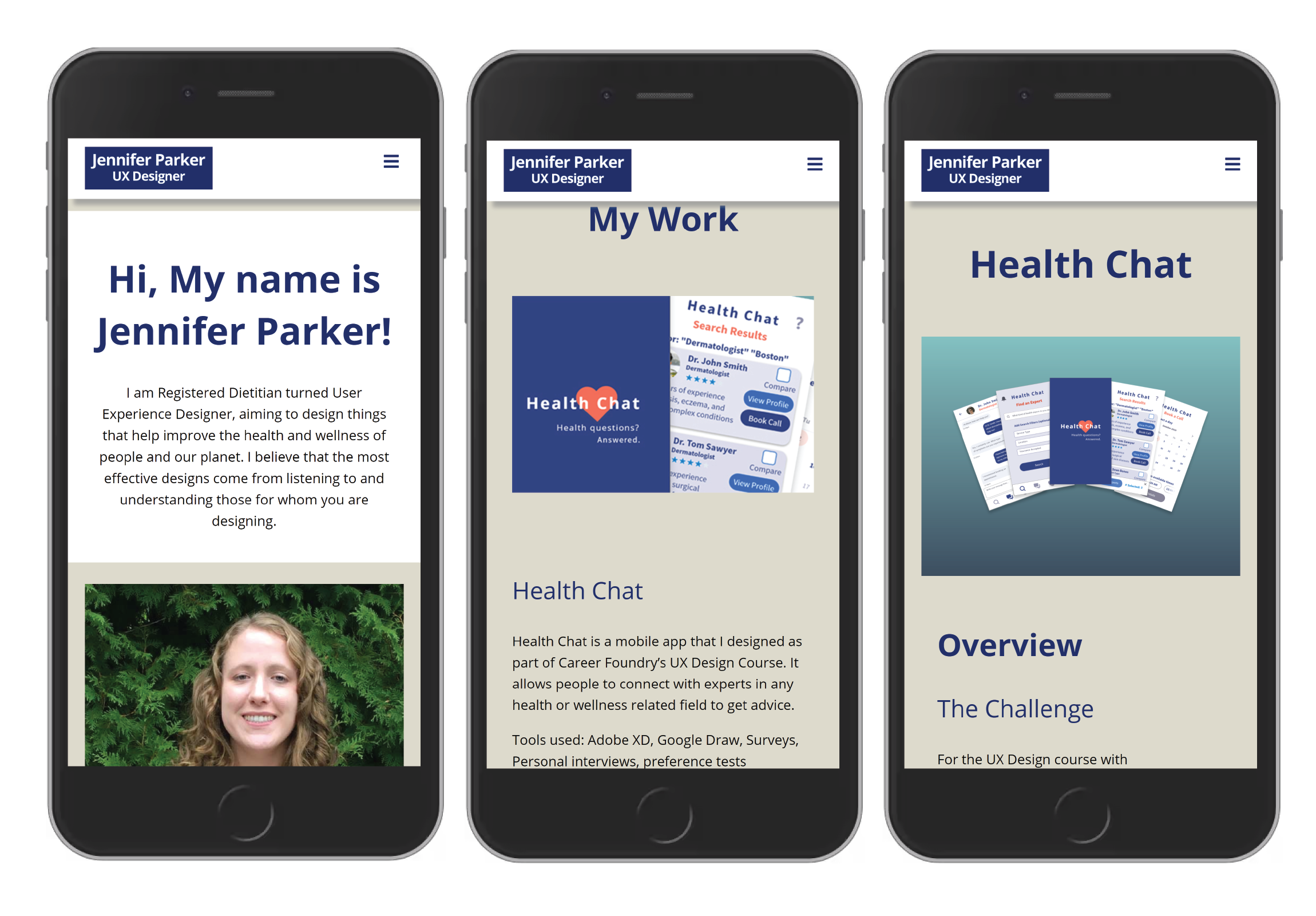
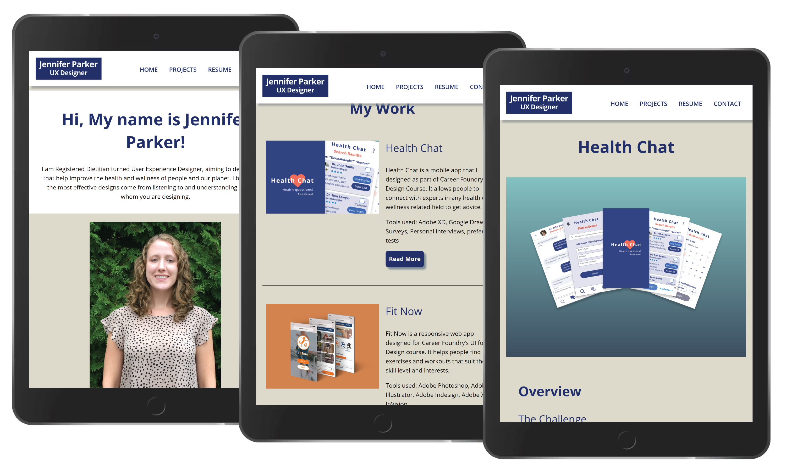
The final product is a responsive portfolio website with 4 main navigation items. In mobile view, these navigation items are hidden under a hamburger icon and appear upon tapping the icon.
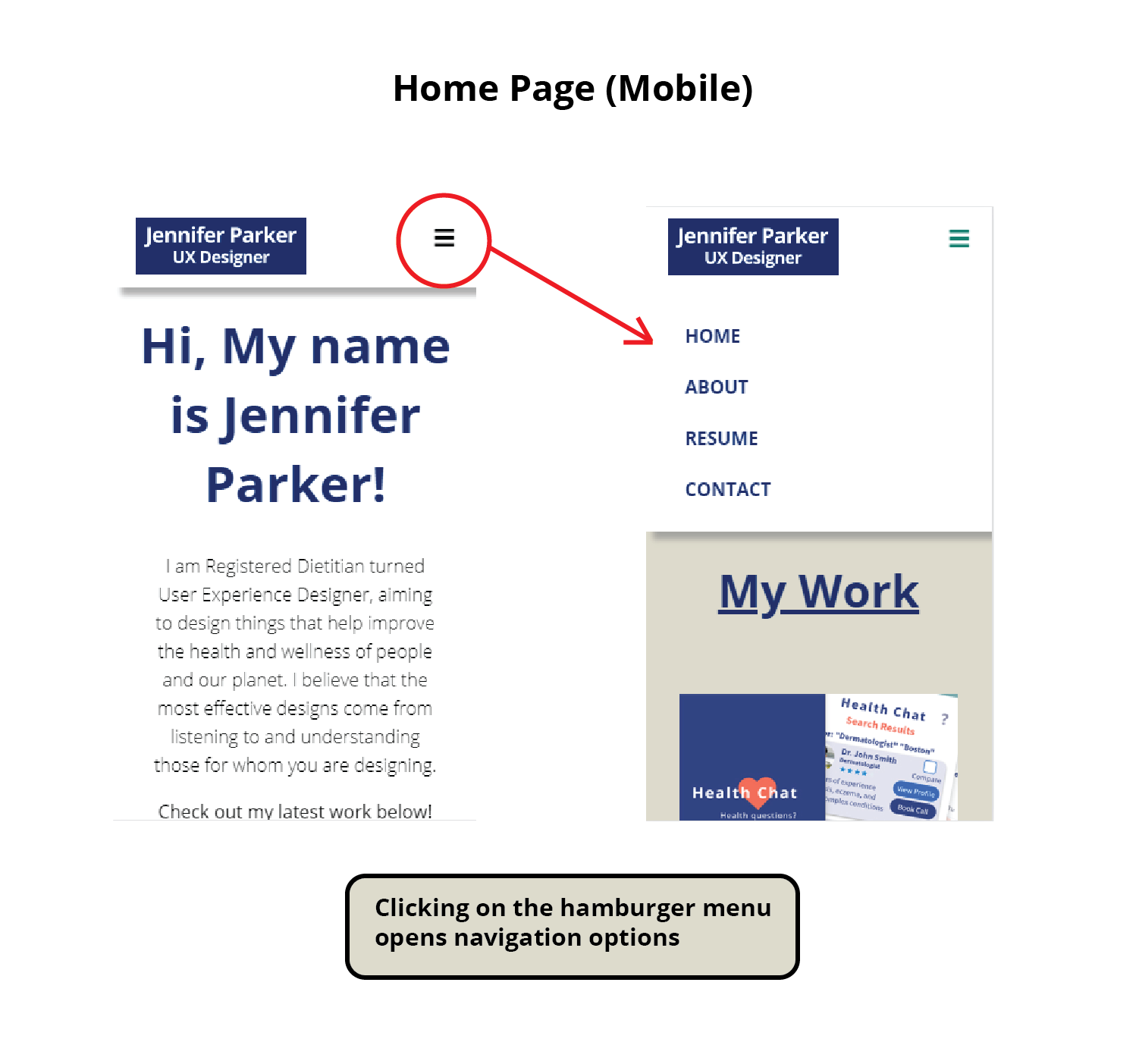
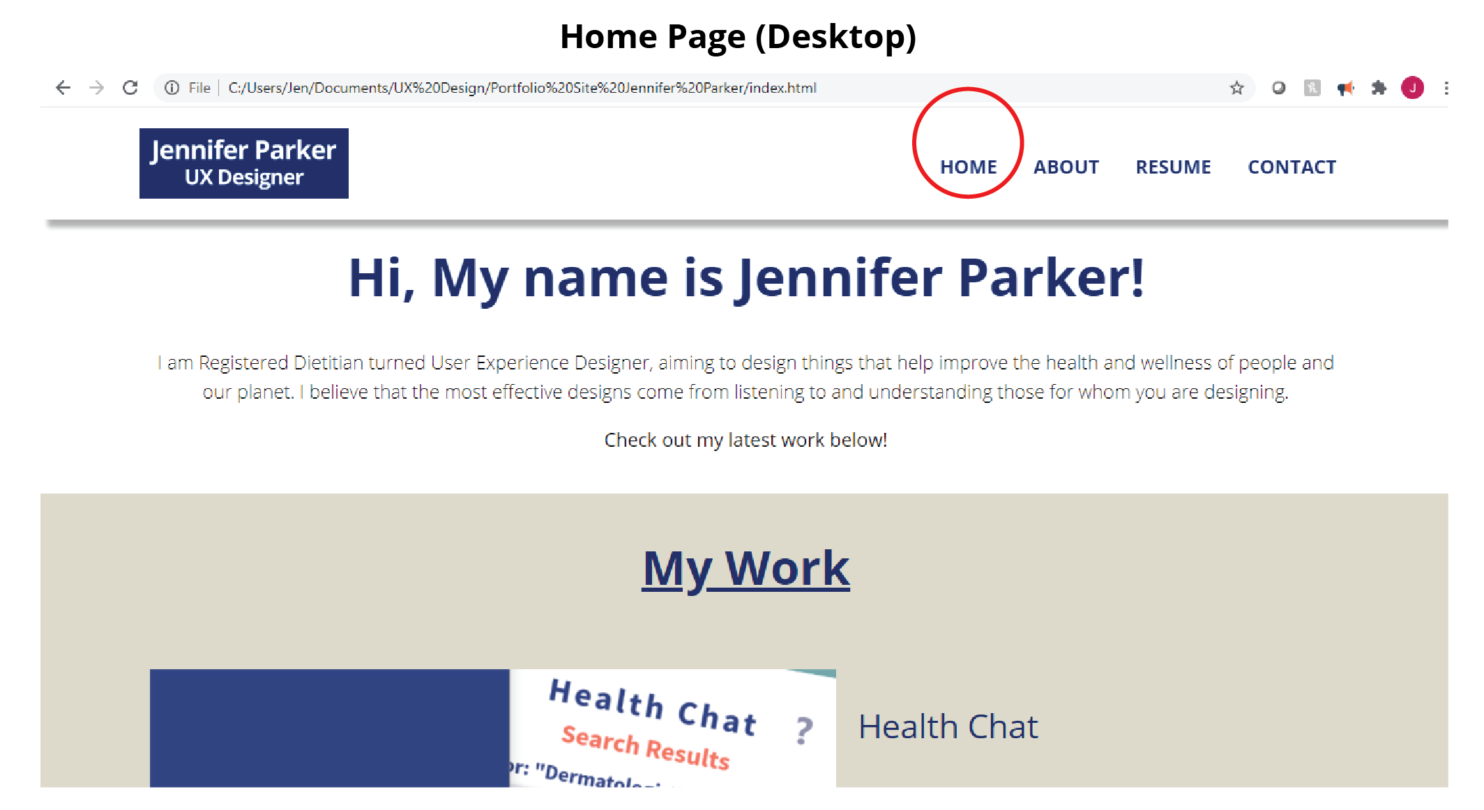
The “home” page has an introduction of myself as a designer, and a list of all projects I have completed that link to individual project subpages.
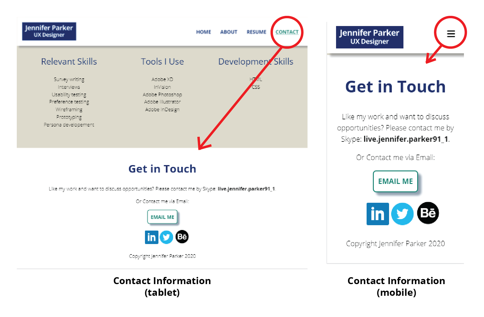
The “Contact” navigation item drops the user to the bottom of the page where they can click hyperlinks to quickly get in touch and initiate a conversation, if desired.
The “resume” navigation tab also links directly to my resume for another simple way to access it.
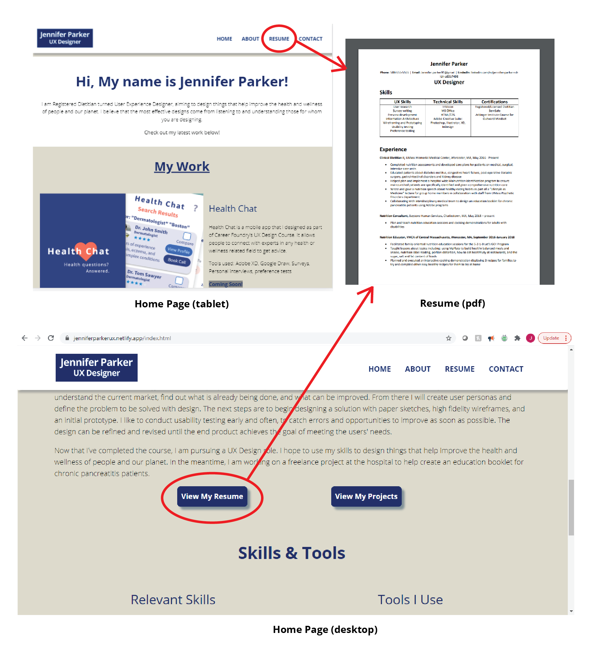
The “about” page has a description of my journey to becoming a UX designer from an unrelated field of work. It also has a link to my resume, and a list of skills and tools I am able to use.
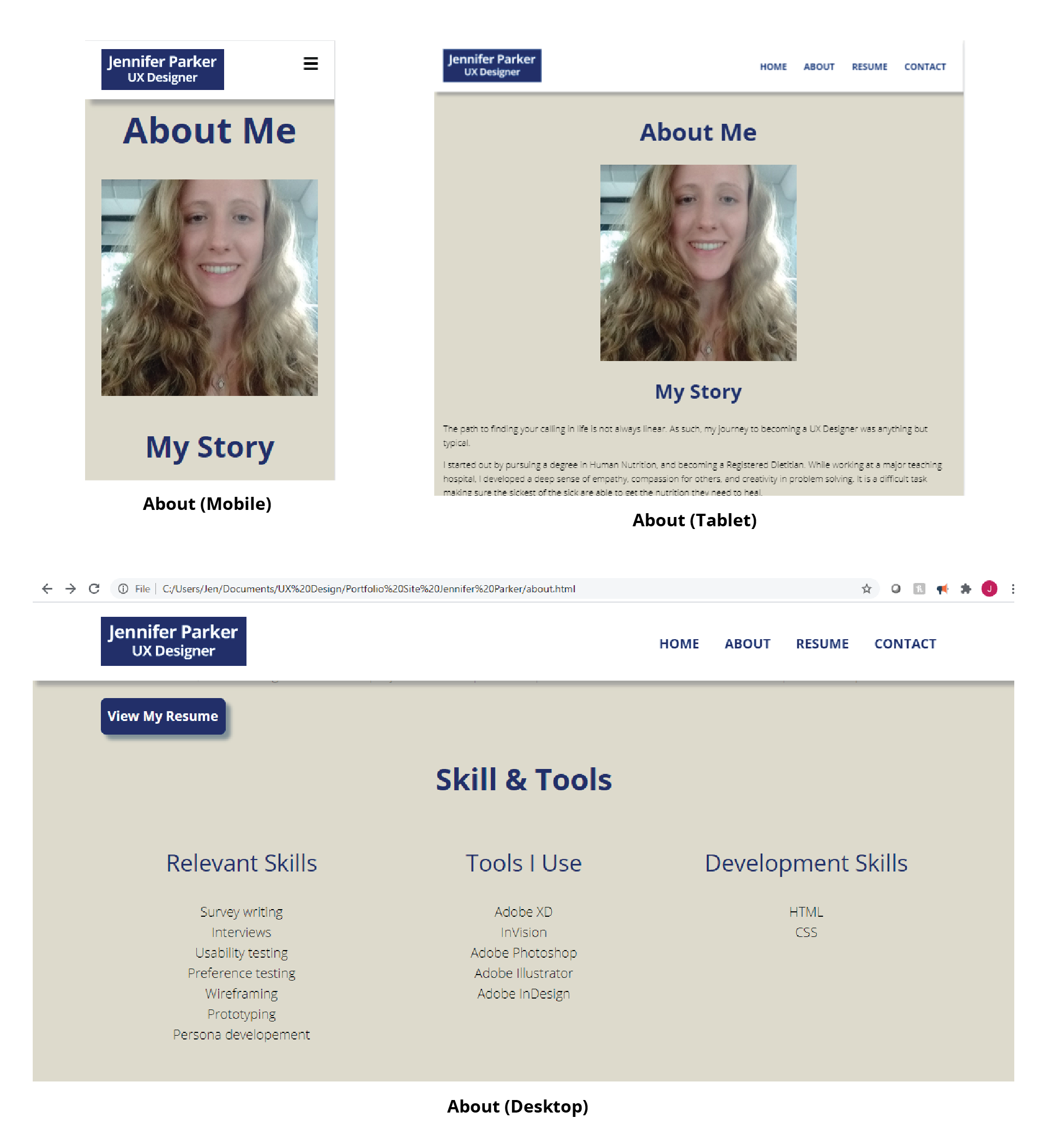
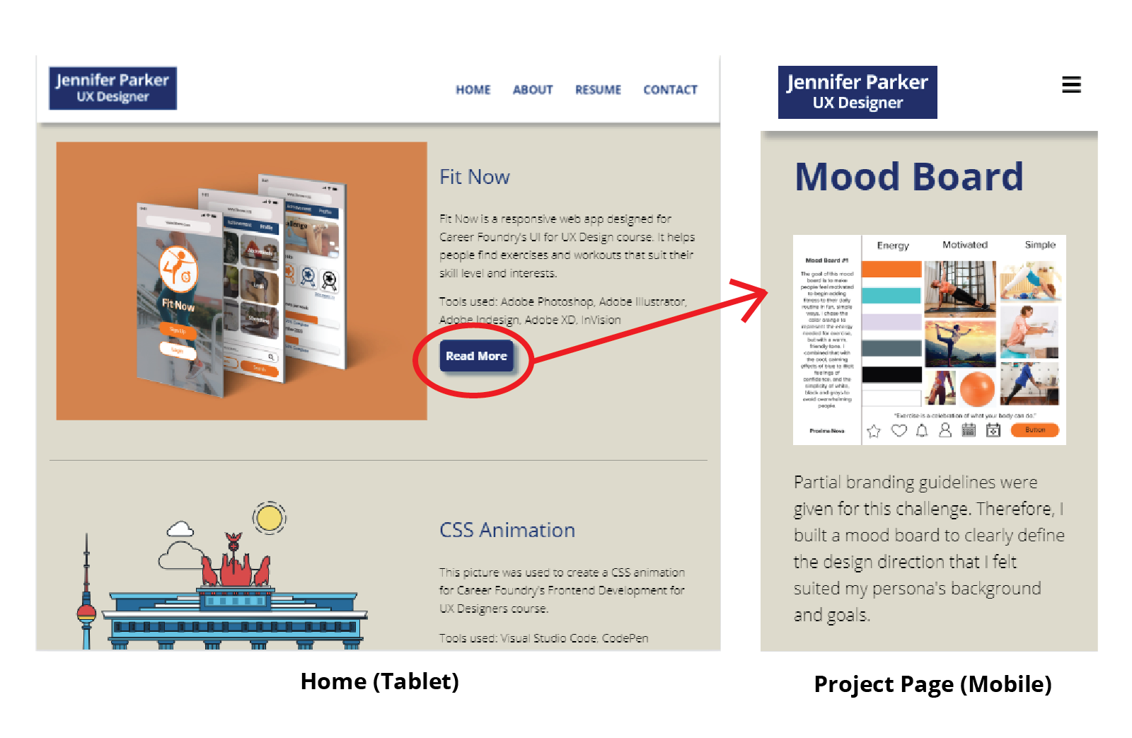
Each “project” listed on the home page has a brief overview description with tools that were used and a photo preview. Clicking on the “read more” buttons will open the full project subpage with more details.
Results
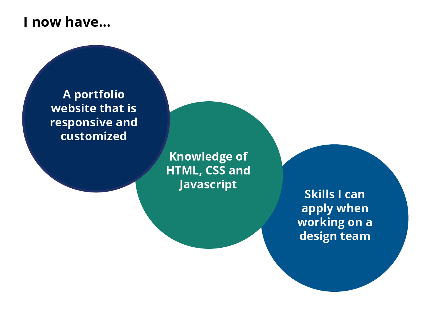
The results of completing this project are that I now have a customized portfolio website, I have learned to use HTML, CSS, and Javascript, and finally that I have skills that can be applied when working on a design team.
Final Mockups
Here are the final mockups for my portfolio website in both mobile and tablet form!
