Health Chat

Overview
The Challenge
For the UX Design course with CareerFoundry, I was challenged to find a way to connect anyone, anywhere with an expert in any field. I chose to focus on health and wellness fields.
The Background
There are many ways to obtain information about health related topics... a doctor, websites, self-proclaimed experts. However, some of those resources can be misleading or inaccurate and it can be difficult to know when that is the case. Sometimes what we need is a verified expert to provide us with accurate advice.
The goal of this app is to create an easy, intuitive way for people with busy schedules to get reliable answers to their health questions, whenever they need it.
My Role
I was responsible for the entire design process: research, developing user personas and user flows, wireframing, user testing and building a high fidelity prototype. The project duration was May - November 2019.
My Approach: Design Thinking
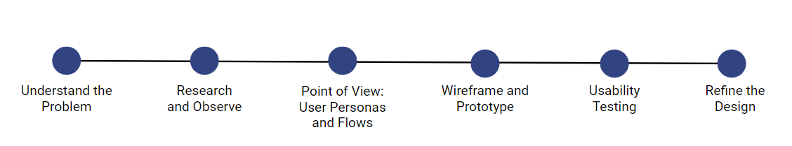
I utilized the design thinking process because it puts the user at the forefront. It helped frame solutions to design problems around what is most important to users.
Understanding the Problem
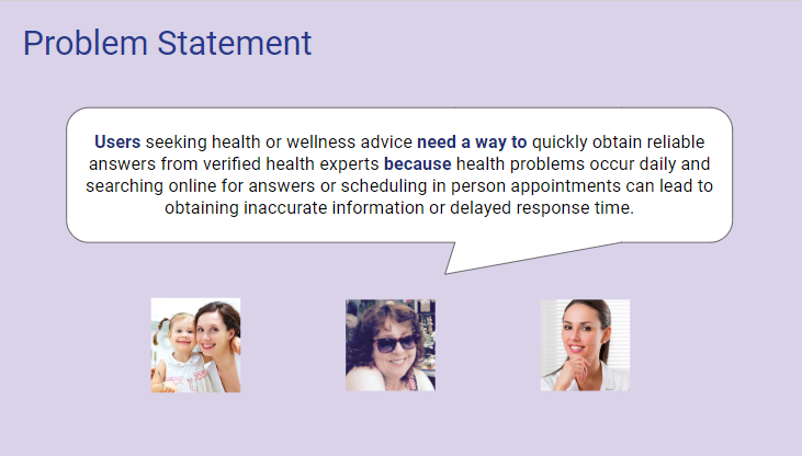
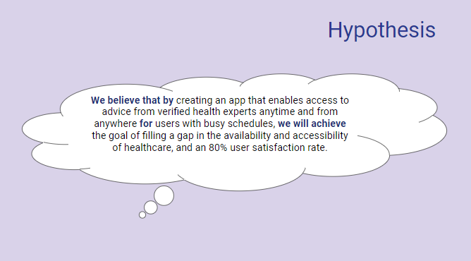
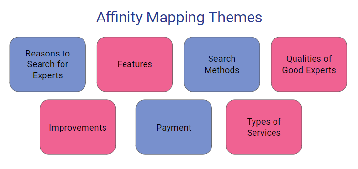
I began by delving into the problem space by conducting user research. This helped me see the problem from the user's perspective. I used affinity mapping to analyze the results of my user research. I also completed a competitive analysis to gauge what products are already on the market and what they have to offer. From this I formulated a problem statement and hypothesis for this project.
User Interviews
Conducting user interviews helped identify attitudes and behaviors around seeking a health expert, methods used in searching for an expert, and pain points throughout the process. I used affinity mapping to analyze my results and identify key insights to guide the designing of Health Chat.
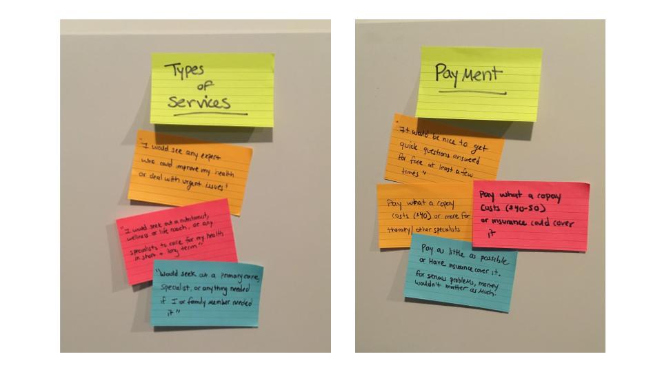


Key Insights
- People are busy and need to find information quickly. Therefore all relevant expert information should be in one place and organized logically
- In order for users to feel confident, experts should have appropriate credentials for their field and a baseline number of years of experience
- People need to find general care experts as well as specialists with current updated information, on both routine and urgent timelines
- No single app or search method has perfected a way of having concise, complete and targeted information, with minimized clutter, that can be navigated intuitively to prevent user mistakes
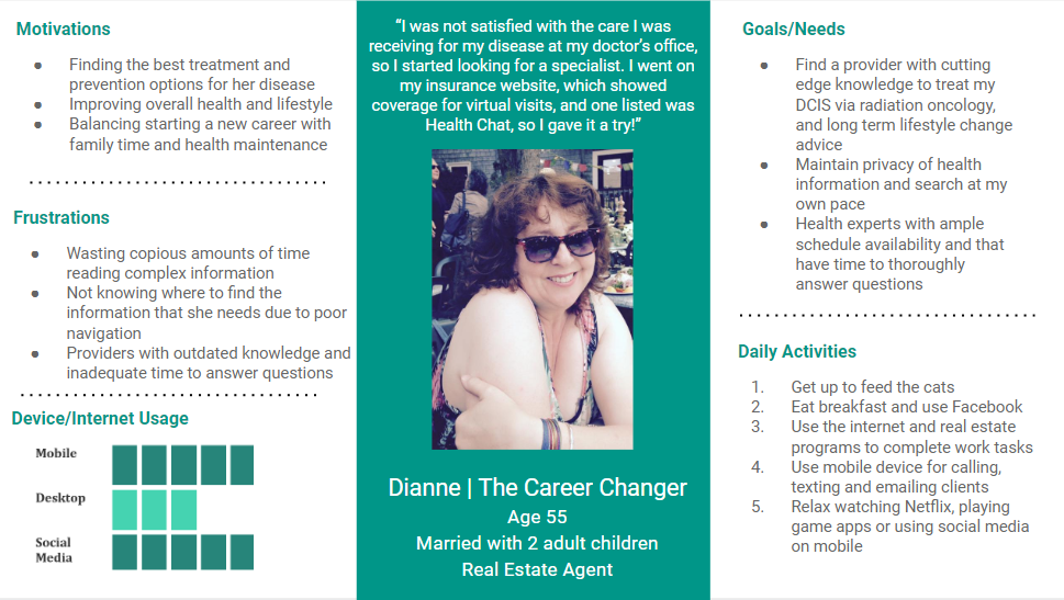
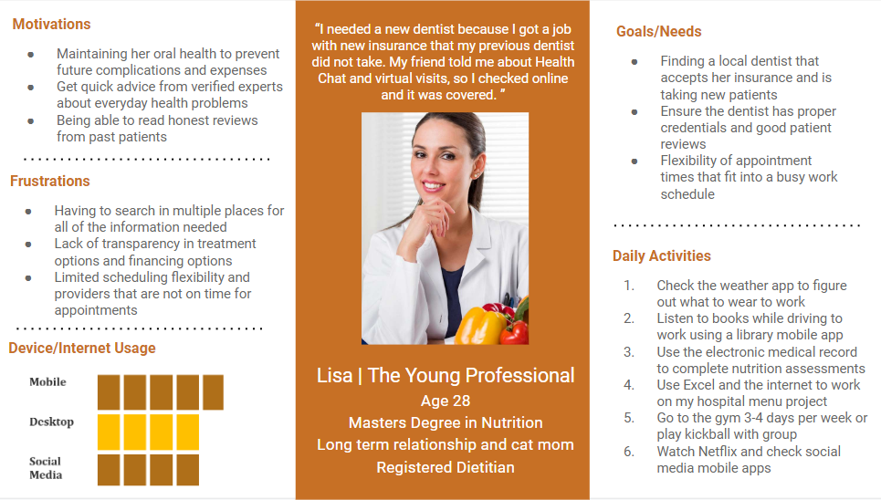
User Personas
In order to bring my users to life, I created user personas based on the information I gathered in my user research. The personas help empathize with the user and understand what she/he will need the application to do.
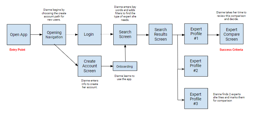
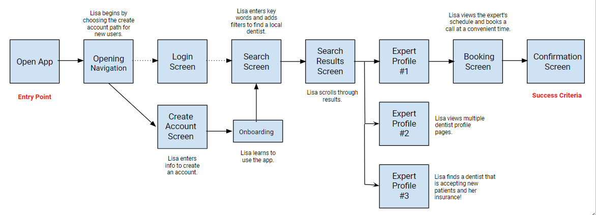
User Flows
Based on data I gathered from the interviews, I was able to identify the needs of my users and key tasks they would need to complete. I then drafted my users flows to illustrate the main tasks within the app.
For the persona Dianne, being able to compare experts side by side was a priority.
For the persona Lisa, being able to book an appointment from the app was a priority.
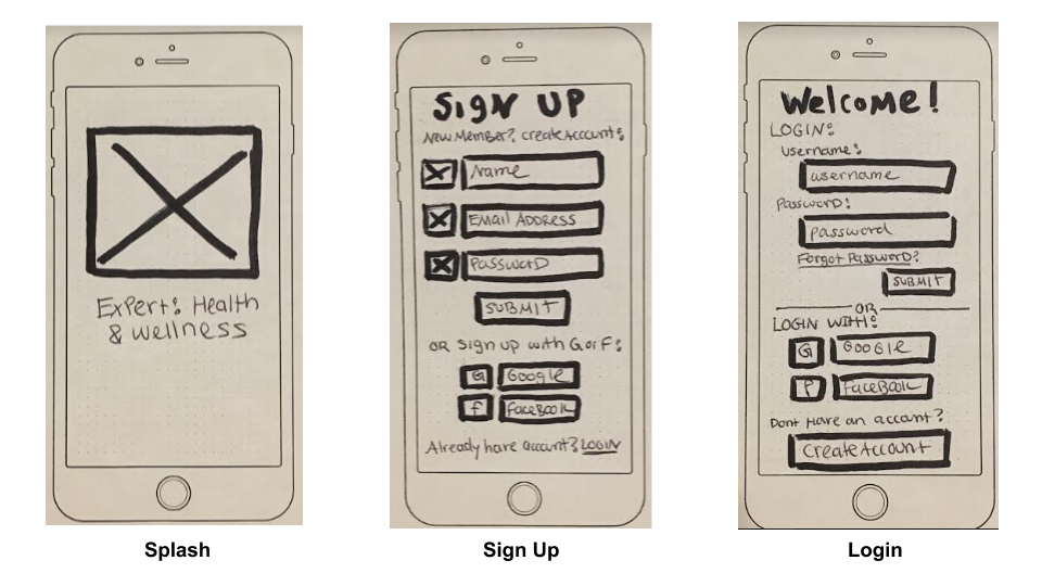
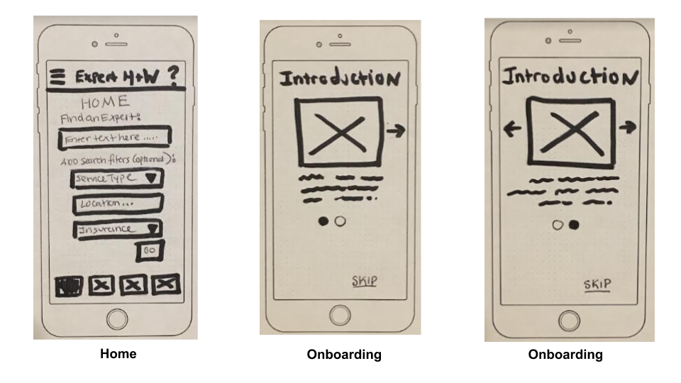
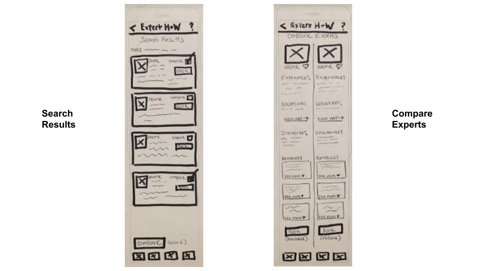
Low Fidelity Paper Wireframes
With user flows in hand, I began my design work with simple pen and paper wireframes. I sketched out the basic layouts of how I wanted the screens to be set up.
High Fidelity Wireframes
I continued to iterate on the design of the mid fidelity wireframes, as well as adding an initial color palette from a UI kit to create my high fidelity mockups.


Usability Testing
I conducted usability testing using the moderated in person method to achieve these specific goals and objectives:
Research Goals
- To assess usability and learnability of Health Chat mobile app for first time users
- To observe and measure if users understand the app and can complete basic functions, such as searching for, comparing and booking a call with an expert
- To identify areas to improve to make the app intuitive and satisfying to use
Objectives
- To determine if users can easily sign up and complete onboarding
- To determine if users can identify and utilize the search feature to find an expert
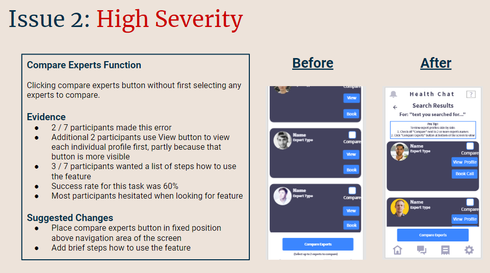
- To determine if users can easily use the comparison feature to compare experts’ qualifications
- To determine if users can book a call with an expert

Usability Test Analysis
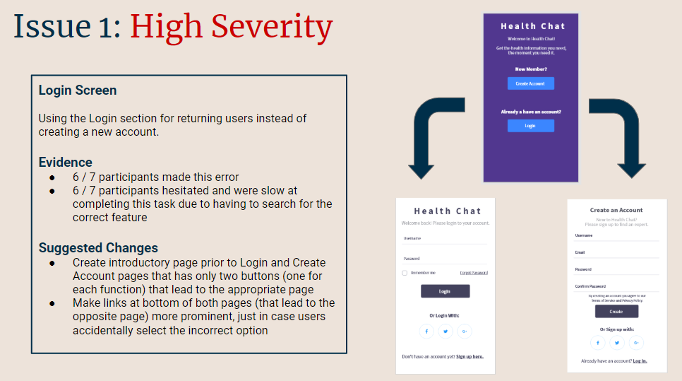
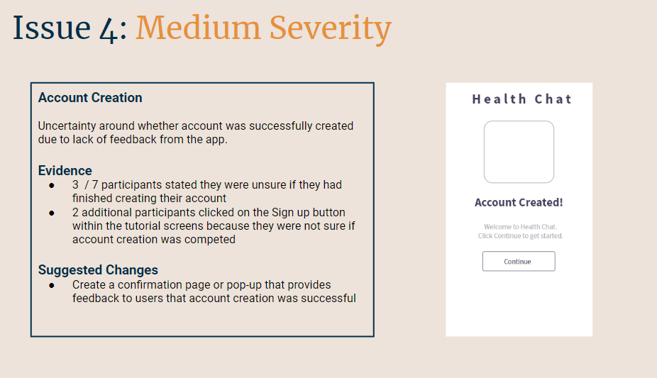
While analyzing results of the user testing and feedback, I identified some key issues that needed to be addressed. The primary issues included: difficulty finding the create account function on the login screen, unclear compare experts function, poor navigation in the tutorial, and lack of clarity regarding if an account was created.
Preference Testing
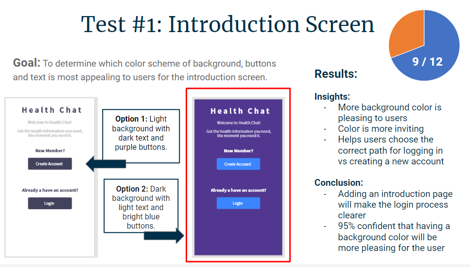
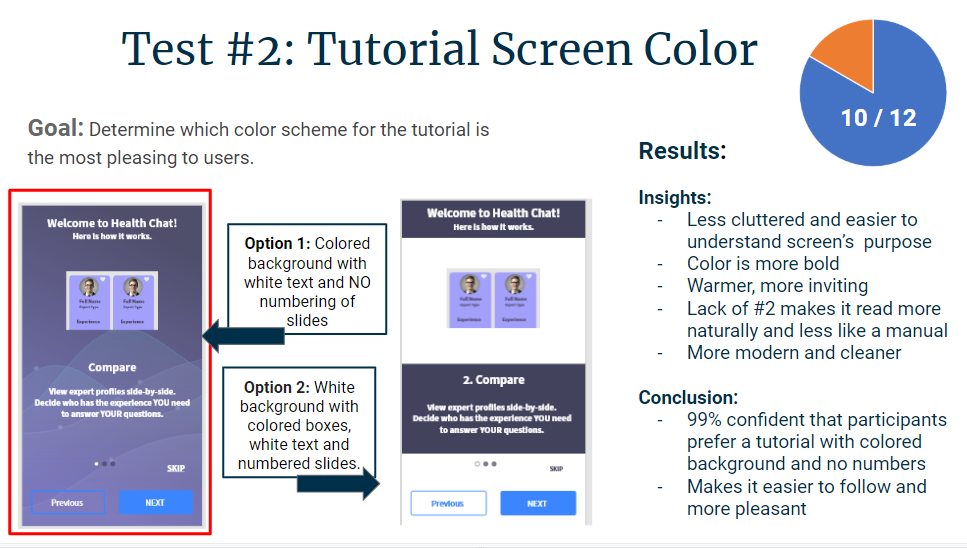
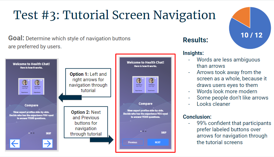
I then conducted some preference testing on a few different screens to gauge which design styles are most appealing to potential users. I determined that people preferred the tutorial to have a full color background, steps that were not numbered, and navigation buttons that had text describing the action of the button. I also determined that the opening navigation screen is more pleasing when the background is a solid color, instead of white.
Conclusion: The Final Mockups
After taking into consideration the results of the user testing, preference testing, as well as a round of peer review feedback, and the guidelines to improve accessibility, I made some final updates to the interface.


Health Chat: The Retrospective
What Went Well?
User interviews and user testing yielded valuable input and insights. This helped identify what key functions were needed in the app and whether or not they were working once built. I was also able to identify and resolve major pain points and errors at an early stage in the design process.
- Skills: user testing, active listening, wireframing, prototyping
- Process: user centered design
- Solution: always conduct user interviews, and test usability often
What Did NOT Go Well?
Because this was the first app I have created, I was slow to get my wireframes and mockups completed. The designs needed to be revised many times due to not meeting iOS or Material Design Guidelines and having usability issues. They also did not look polished due to my limited knowledge of UI design concepts and latest design trends.
- Skills: wireframing, prototyping
- Process: user centered design, using design programs: Adobe, Balsamiq
- Skill gaps: knowledge of common design trends, familiarity with iOS / Material design guidelines, use of Adobe programs
- Solution: Review design guidelines frequently prior to and during the initial design phases, research common design patterns on sites like Dribbble, and watch more tutorial videos to help gain skills using the design programs.
What Can Be Improved?
The icons in the Health Chat app could be more customized instead of being from a UI kit.
- Skills: icons / UI design
- Process: developing an iconography style for the app
- Skill gaps: limited knowledge and practice with creating icons in Adobe Illustrator
- Solution: I took the CareerFoundry UI for UX specialization to expand my knowledge of UI concepts. I plan to watch more tutorial videos on how to master Adobe illustrator.